

Cityrush is a healthy food subscription service. They make and deliver every meal of the day based on custom meal programs clients. Their clients are health and fitness oriented busy people by age of 20s to 30s.

Main problems
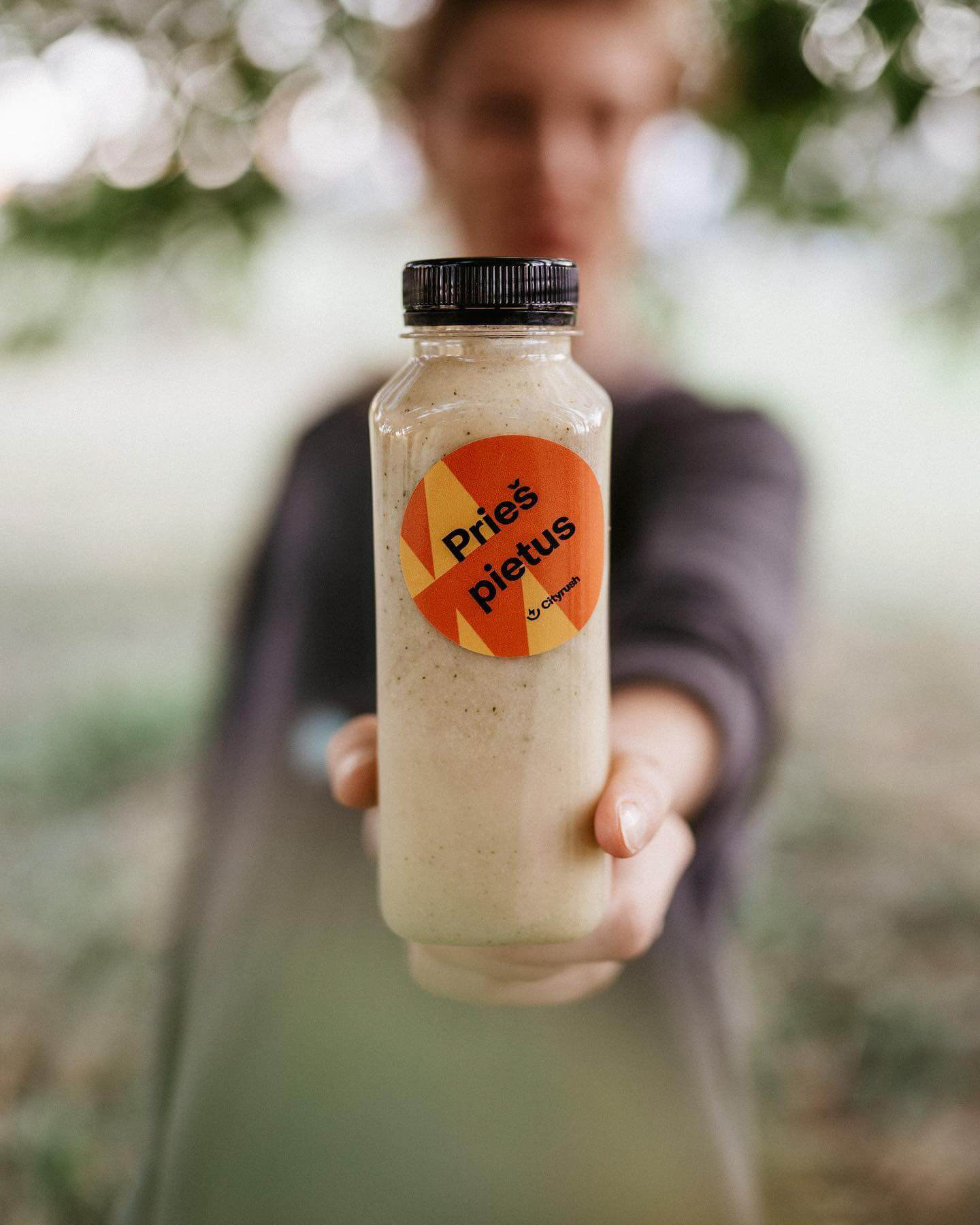
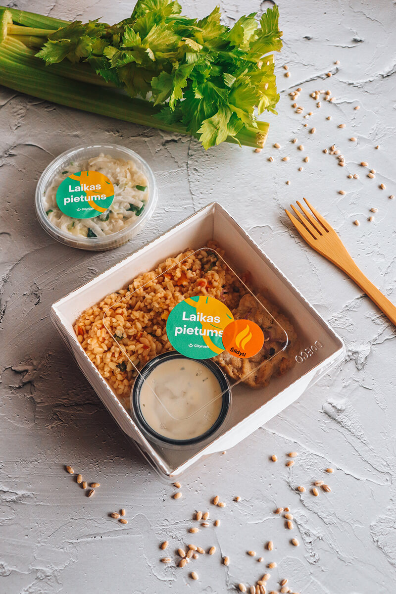
My main goal was to improve their visual identity. They felt it no longer represented the quality of their services, as well as it did not reflect their audience – it looked too corporate. Also, their competitors looked very alike, so they needed a more distinguished style. My objective was to elevate company's visual identity system by making it more fun, yet clean and professional. It also had to stand out from visually similar competitors.

The logo
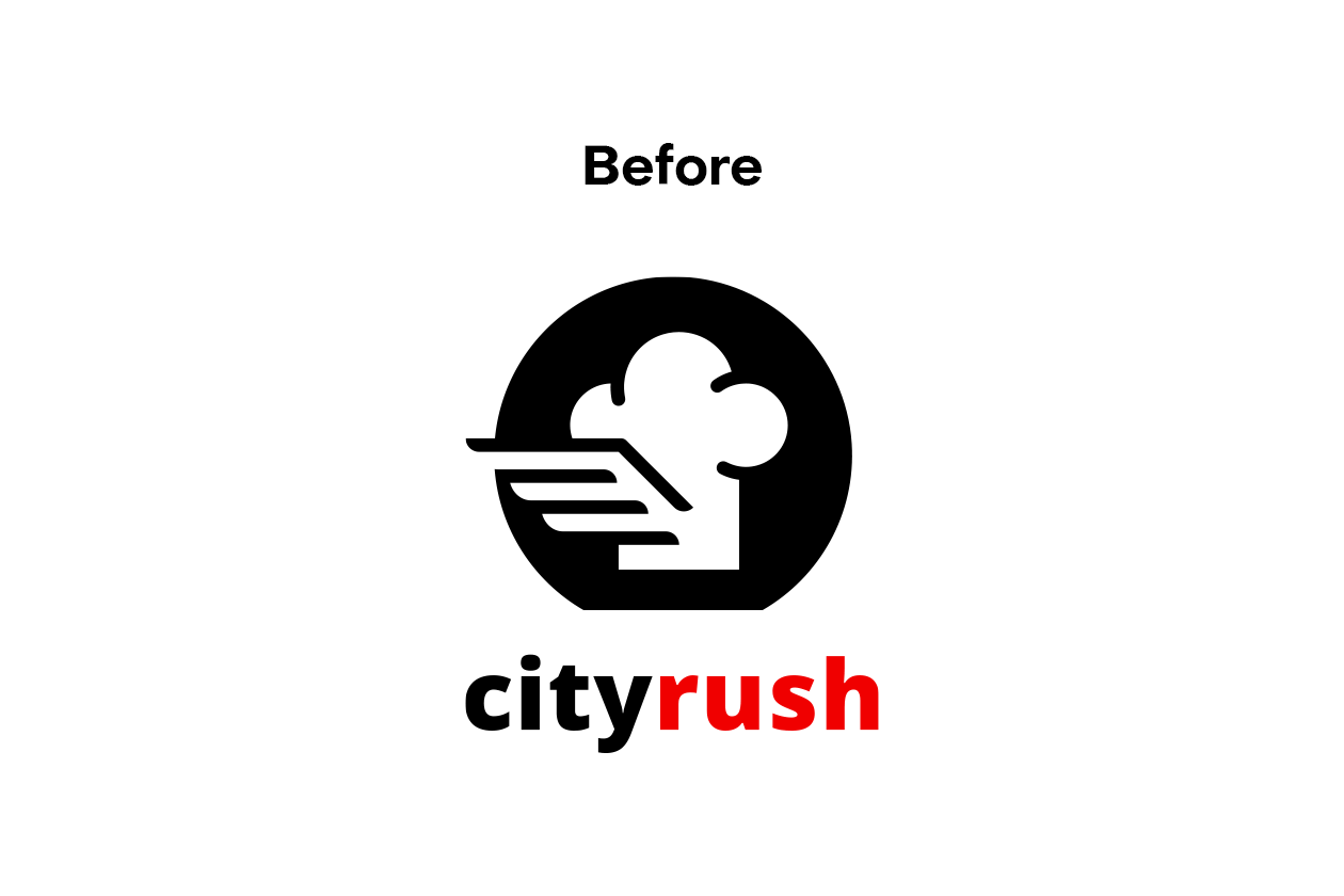
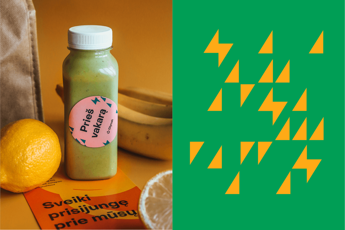
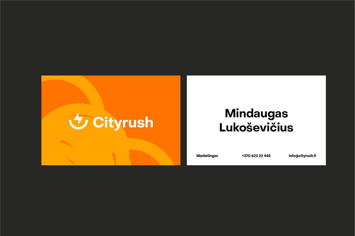
I've changed the logo, as I was feeling it wasn't a strong graphic shape. The symbol was too complicated – on packaging it was hardly eligible. Also, the colour red was too aggressive for the brand. The new logo consists of a bolt in a bowl. It symbolises Cityrush's purpose – eating healthy food that is a good energy source for active lifestyle.
Typography and colours
Brand typography needed a push towards friendlier and more youthful vibe. To achieve that, I've chosen a geometric sans serif typeface.
There was an issue with the former red brand colour. The company felt it was 'off', so they eventually started using green on their web, while keeping red on social media and print. Unfortunately, the competitors' main brand colours were a very similar shade of green.
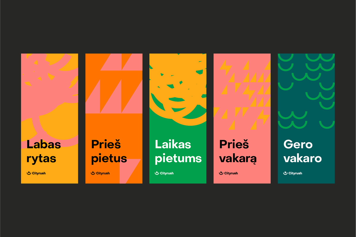
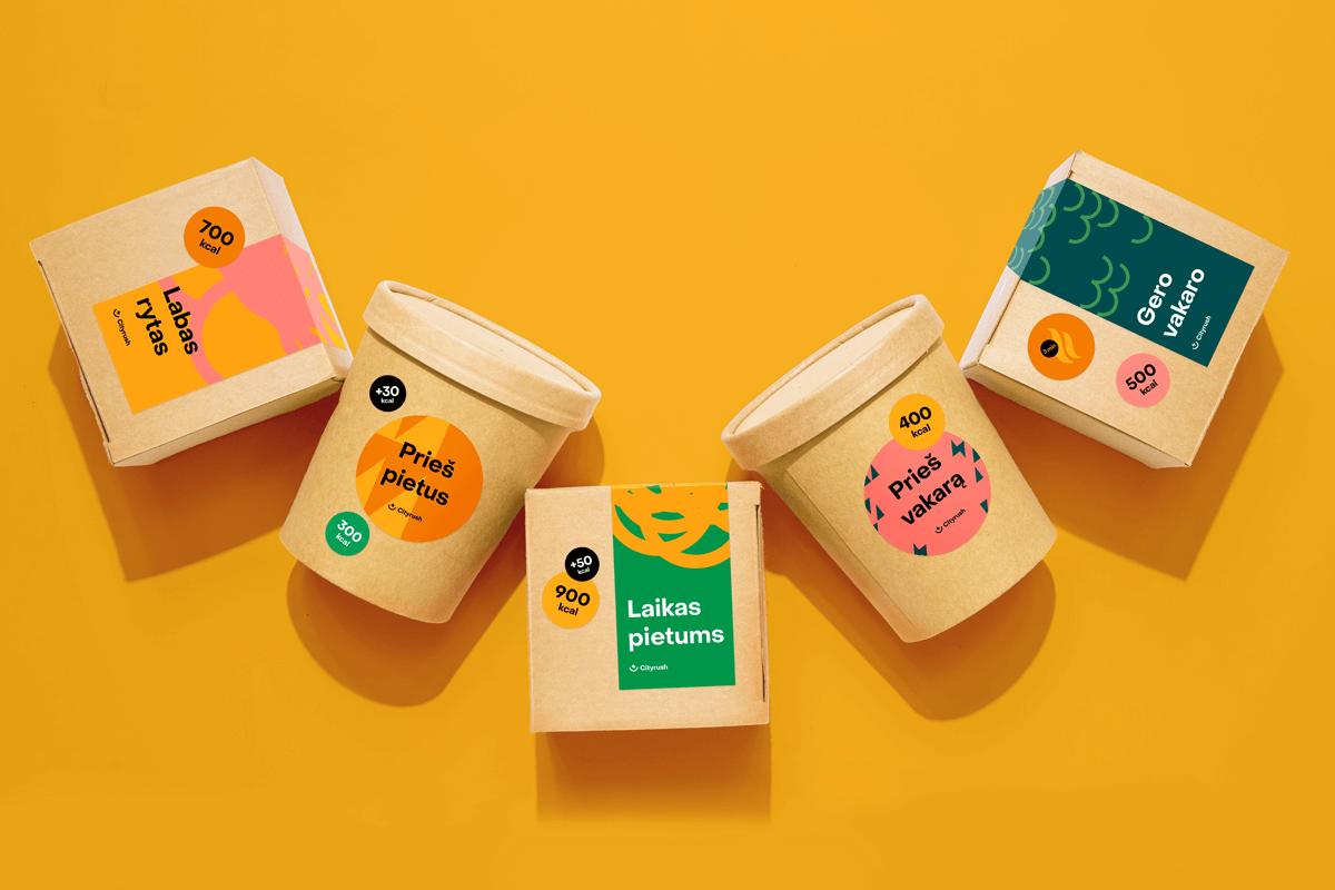
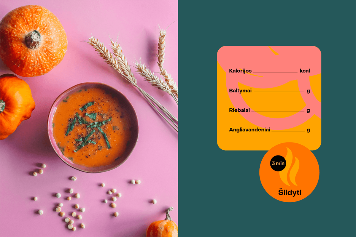
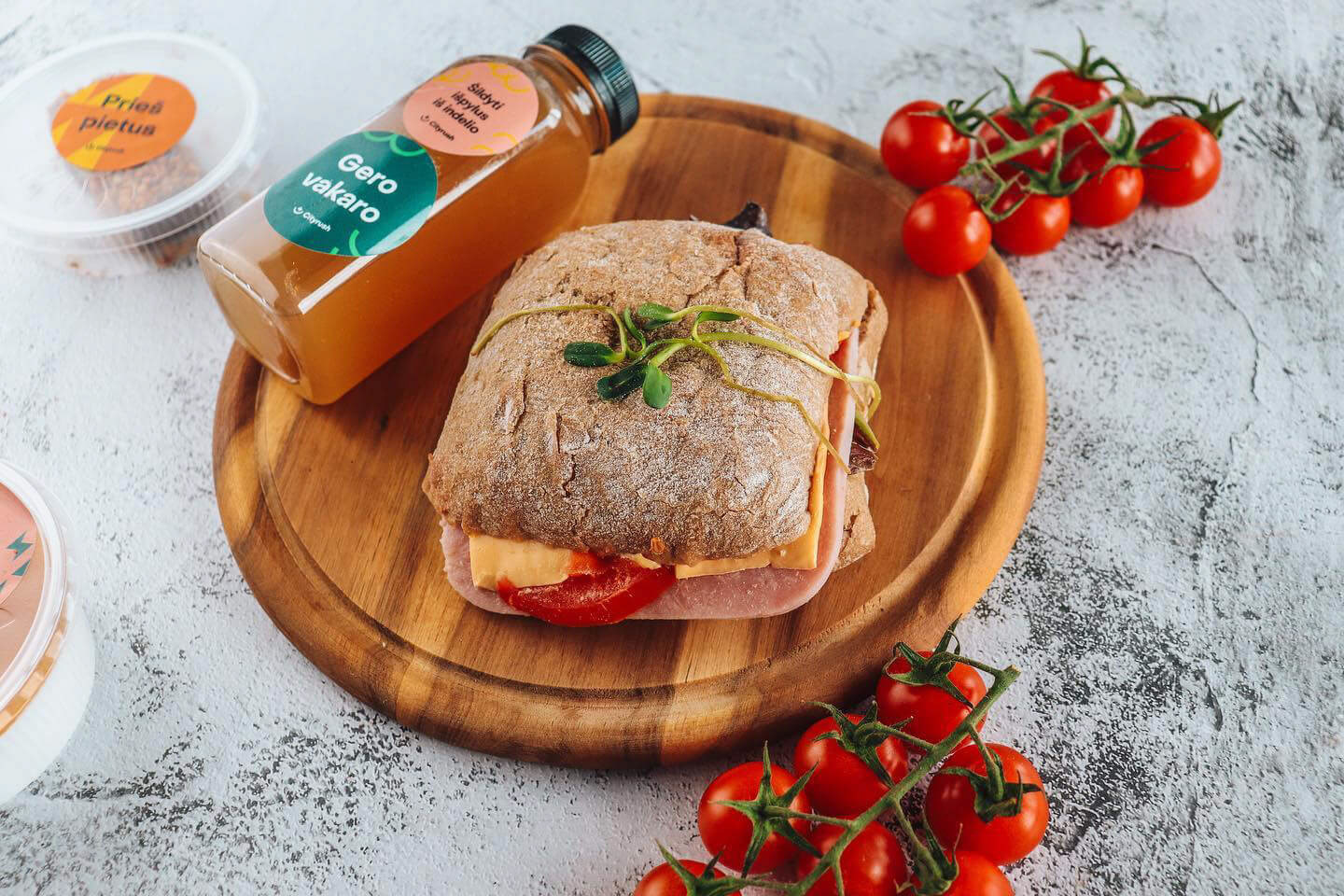
I decided the brand needed to stand out by having more than one brand colour. Therefore, current colour palette consists of lively matching colours that fit into food, health and fitness context well.


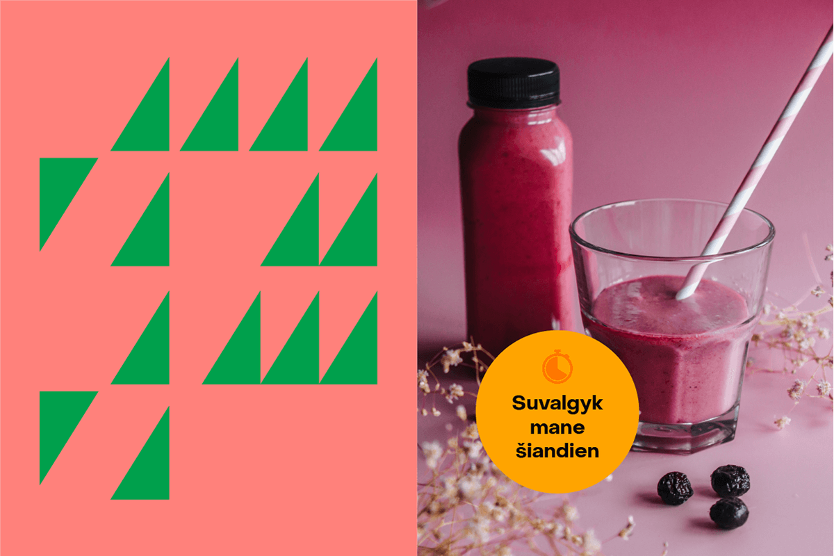
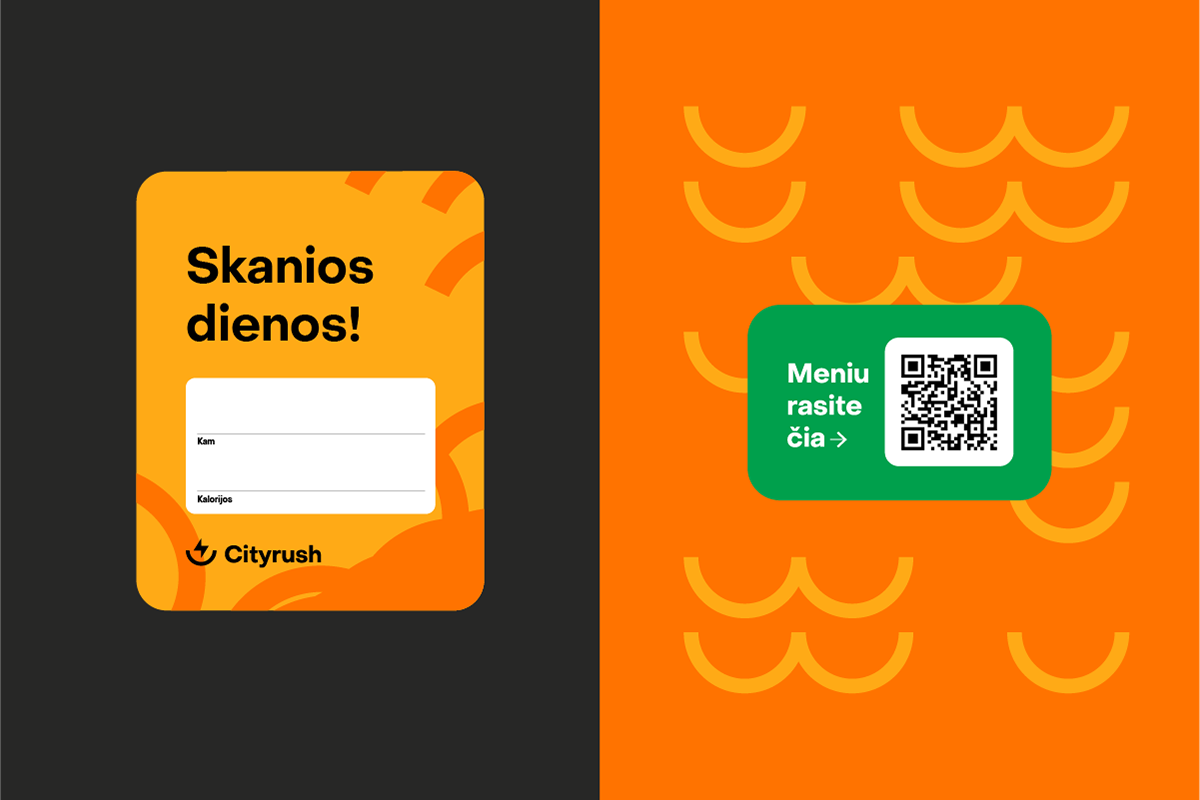
Graphic elements
By duplicating and playing with the logo shapes, I made a few simple patterns. If the client eventually grew tired of these patterns, they could easily create new ones just by rearranging the shapes.

Client: Cityrush
Sector: food, health, fitness
Services provided: logo, branding, packaging, stationery
Location: Lithuania
Year: 2020
Sector: food, health, fitness
Services provided: logo, branding, packaging, stationery
Location: Lithuania
Year: 2020